Levi’s Made of Progress

An interactive experience that delivered compelling content against Levi’s four pillars of sustainability.
Next Project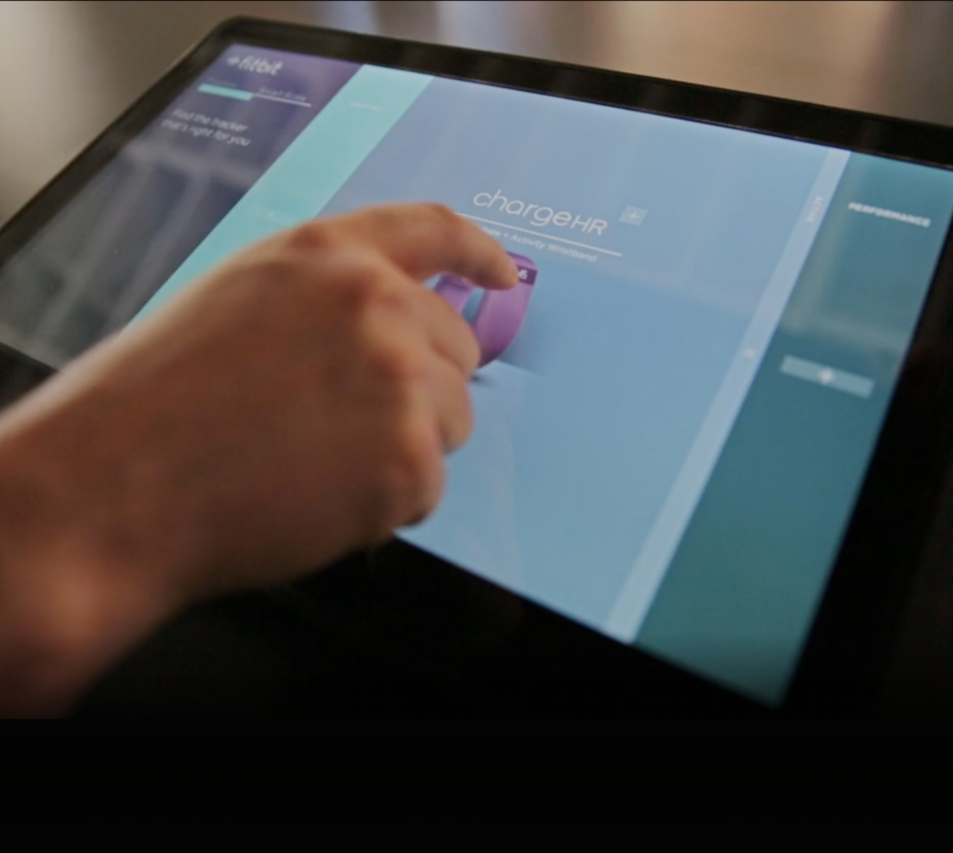
Fitbit is dedicated to transforming lives through products that inspire a healthier life. To help achieve that goal they turned to IRON to develop a variety of engaging, innovative retail experiences.
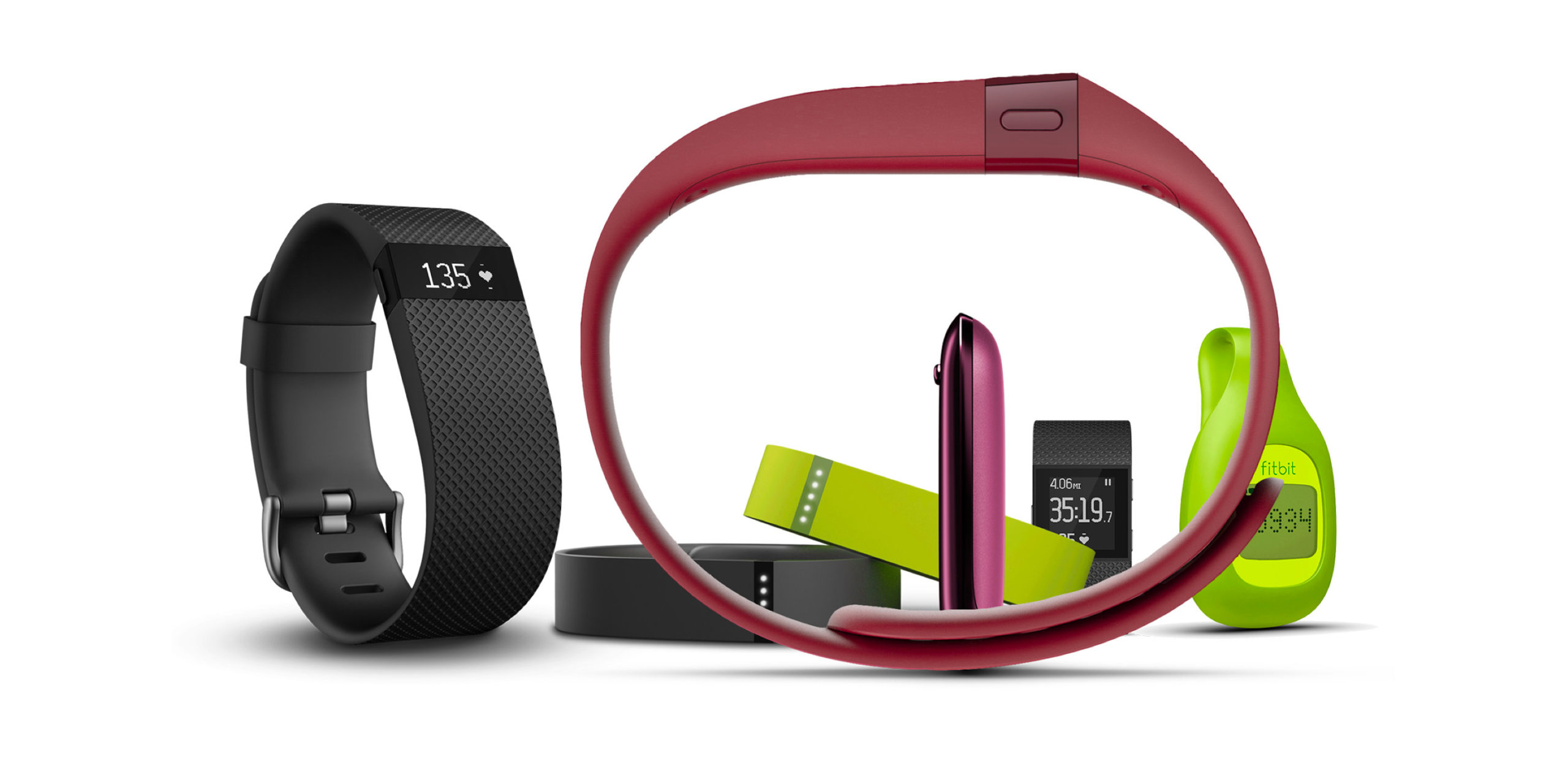
While wearable technology is gaining an increasing foothold, it still remains a relatively new product segment. Fitbit needed a digital tool that would help clarify the offering in consumers’ minds, but also give them a thorough overview of the brand’s range of wearable devices.
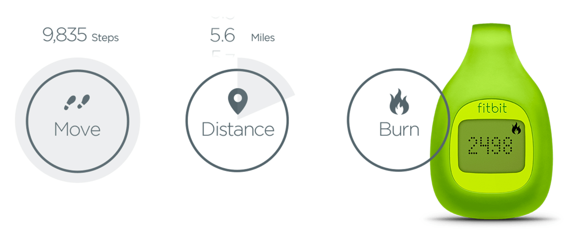
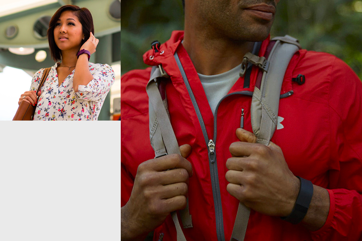
Our goal was to provide a compelling and intuitive user experience that motivated customers to engage with and buy Fitbit products. We used a simple linear narrative to encourage users down a path built from a library of photos, animated type, iconography, and video.
Before approaching design we shared a variety of UX strategies that would underpin the creative process. We experimented with three conceptual approaches: a simple path to product information; a deeper demonstration of how Fitbit can positively affect your life; and finally a more immersive video-based focus on the emotive aspects of the Fitbit brand promise.
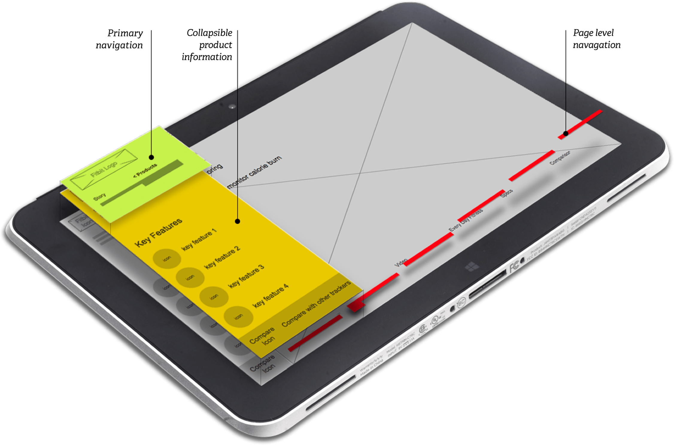
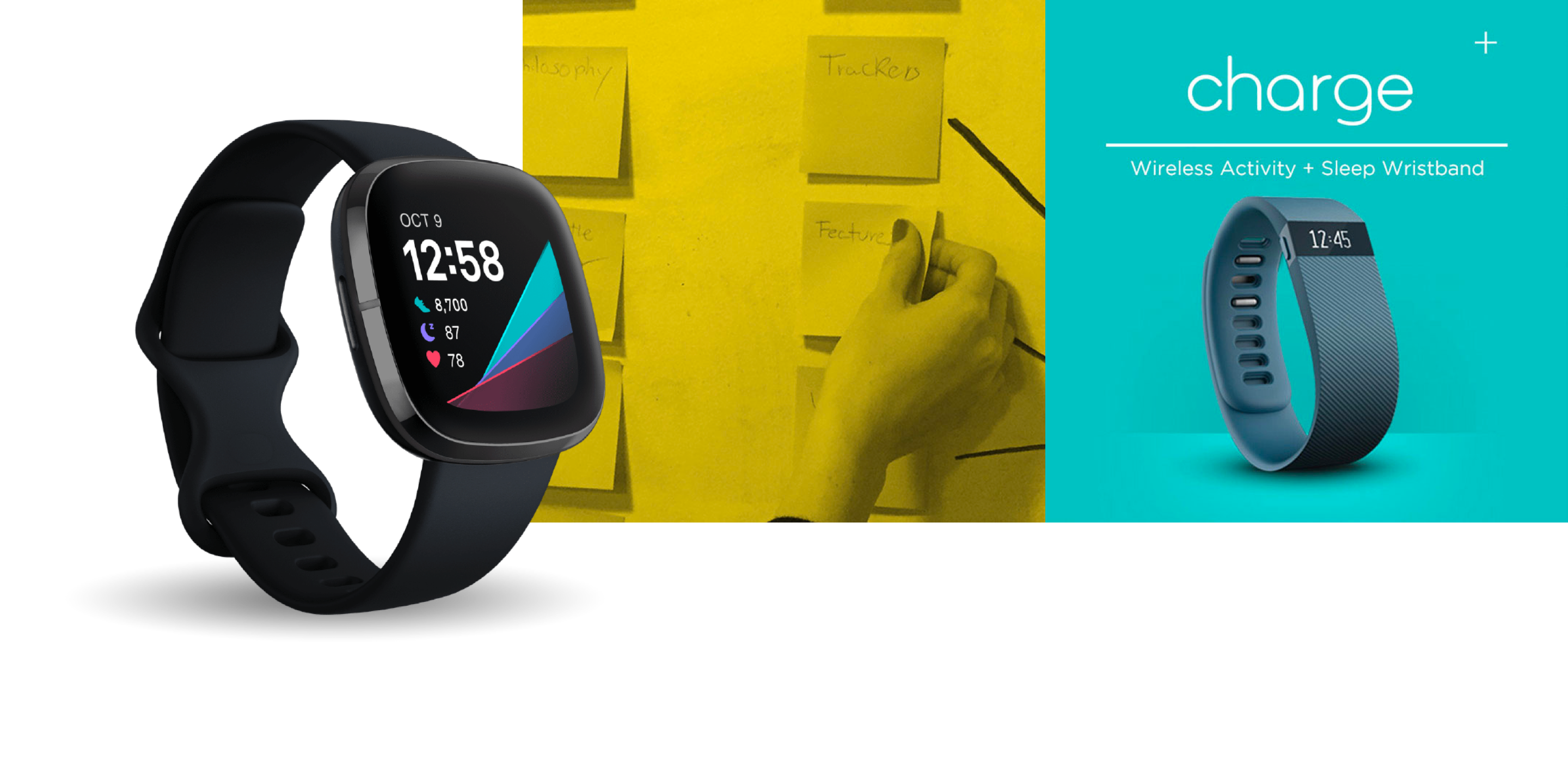
We worked seamlessly with the Fitbit team to design a state-of-the-art user interface – built with both existing brand assets and a suit of new illustrative and typographic expressions. The net result is a stunning piece if interactive design that reflects the innovative nature of the Fitbit family of products.
The app launched to rave reviews in Best Buy and Target stores throughout the country and was soon followed by further iterations in Canada. The device formed a central part of the company’s booth display at the Consumer Electronics Show and was later deployed overseas.
Stores used the app nationwide
Months to deploy