The New Golden Rules Of Product Page Design
With digital sales on the rise, the pressure has never been greater on product display page design.
With digital sales on the rise, the pressure has never been greater on product display page design.
While brick and mortar stores are shuttering all over the country, digital sales are set to expand rapidly. Some pundits predict annual growth in excess of 23% and eMarketer expects e-commerce sales to increase to a whopping $4 trillion by 2020.
That puts a lot of pressure on an often overlooked part of the retail experience: the product display page. Historically the preserve of engineers, rather than UX and visual designers, product pages can resemble a poorly conceived mash-up of badly lit photos and hard to decipher product features. But thankfully, for those with a sensitive aesthetic disposition, a host of new experiences are informing the design of the best pages on the web.
Before we get into the specifics, it’s worth outlining some fundamentals. Product detail pages must do three things well:
With those broad principles to guide us, here’s our breakdown of the new golden rules for product page design.
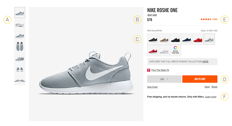
A Nike PDP: the gold standard in e-commerce

Above the fold: the new minimum standard
There are six main elements that are critical for conversion. These should be included in the initial load of the product display page and appear above-the-fold on desktop.
Merchandising is everything
The quality of your product images directly affects your ability to generate sales. In fact one study confirmed that 92.6% of online shoppers say visuals are the most influential factor affecting their purchase decisions.
Let the copy do the talking
Having an effective copy strategy is essential – and getting the balance right in terms of the types and amount of copy is critical.
The power of the moving image
As more and more of us routinely stream content to our devices, product video has become an essential part of the display page mix. In fact, some say product videos can increase conversion by as much as 85%.
Peer-to-peer dialogue
Consumers today can be wary of brand promises. But they are increasingly swayed by the opinions and beliefs of their peers. In fact, 85% of consumers read online reviews before buying. There are always uncertainties when shopping online. This is why a selection of good (and bad) reviews can help nudge your shoppers into buying. When people feel they are informed after reading the pros & cons, they are more likely to take action.
The subtle art of the cross-sell

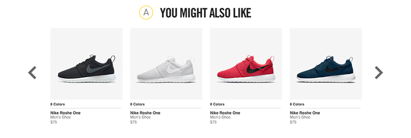
Don’t just sell, cross-sell
In a retail environment, products are painstakingly merchandised and artfully grouped into collections and other compelling visual or thematic associations. Do the next best thing online and guide customers to other products they may also love.
Have a brand moment
According to a new survey, over half of U.S. online consumers begin their product searches on Amazon. And the vast majority of those people pretty quickly land directly on a product display page, bypassing entirely any brand experience.
But don’t despair, there are still plenty of opportunities to build branded content on Amazon and other major retailers’ sites, through A+ detail pages or by using other tools such as webcollage. Take advantage and remind consumers why they fell in love with your product in the first place.
Mobile optimized
For retailers, the debate is over: mobile devices will officially take over from their desktop counterparts by 2021 — by which point some analysts predict 53.9 percent of all retail e-commerce is expected to be generated via m-commerce. And as far as traffic is concerned we’re already well past the tipping point, with mobile internet users now outstripping their desktop counterparts around the world.
And since some pundits suggest as many as 90% of users start a task on one device and finish it on another, optimizing your experience for mobile is no longer optional. Your mobile product page needs to be as consistent as it can be with your desktop version, and capable of saving progress for a seamless experience from one device to the next.
We hope this list gave you some new ideas or at least affirmed your own best practices. From our perspective, there’s one thing today’s research has officially confirmed: mobile-first is no longer an optional strategy – it’s the status quo.
We’ve been designing digital experiences for over 10 years for some of the leading names in retail, pharmaceuticals, and B2B technology. Contact us if you’d like to find out more.
Drop us a line.
Contact us120 2nd St. Floor 3,
San Francisco, CA 94105